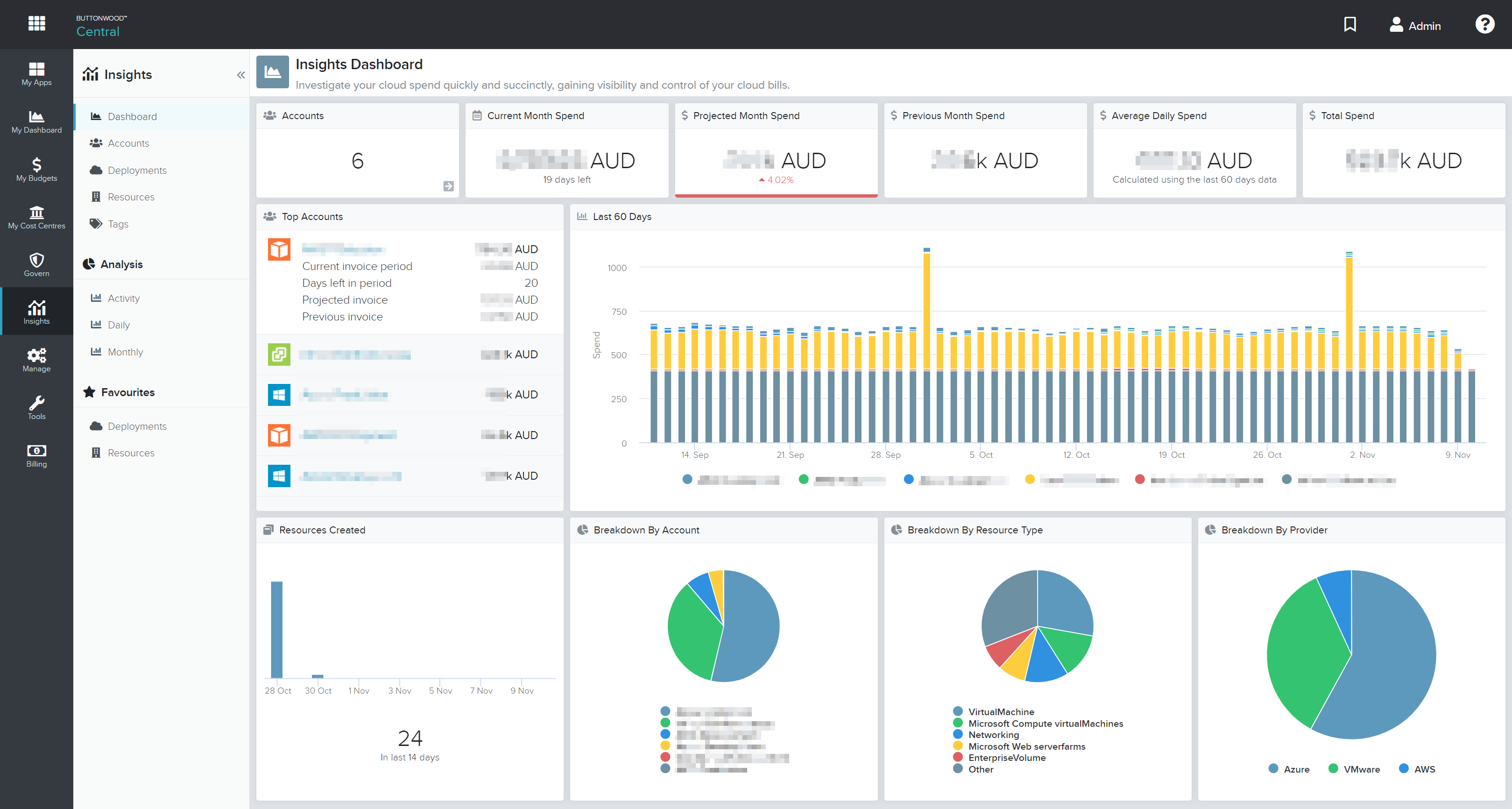
The Insights Dashboard provides an aggregate view of your accounts. From here, cost centre owners and budgets managers can see on one screen the financial metrics and resource breakdown across the entire organisation and drill through to further understand where budget is being consumed.

Accessing Insights Dashboard
- Login to Buttonwood Central
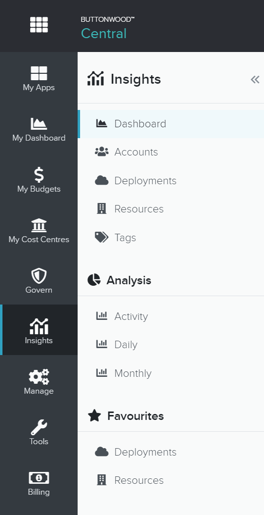
- Navigate to Insights > Dashboard

Top Section
The top section gives an overview of the number of accounts associated with the user. It also details the current months spend, average daily spend and total lifetime spend for all accounts. To keep your spending on track, the Dashboard shows the projected monthly spend and previous monthly spend.

Middle Section
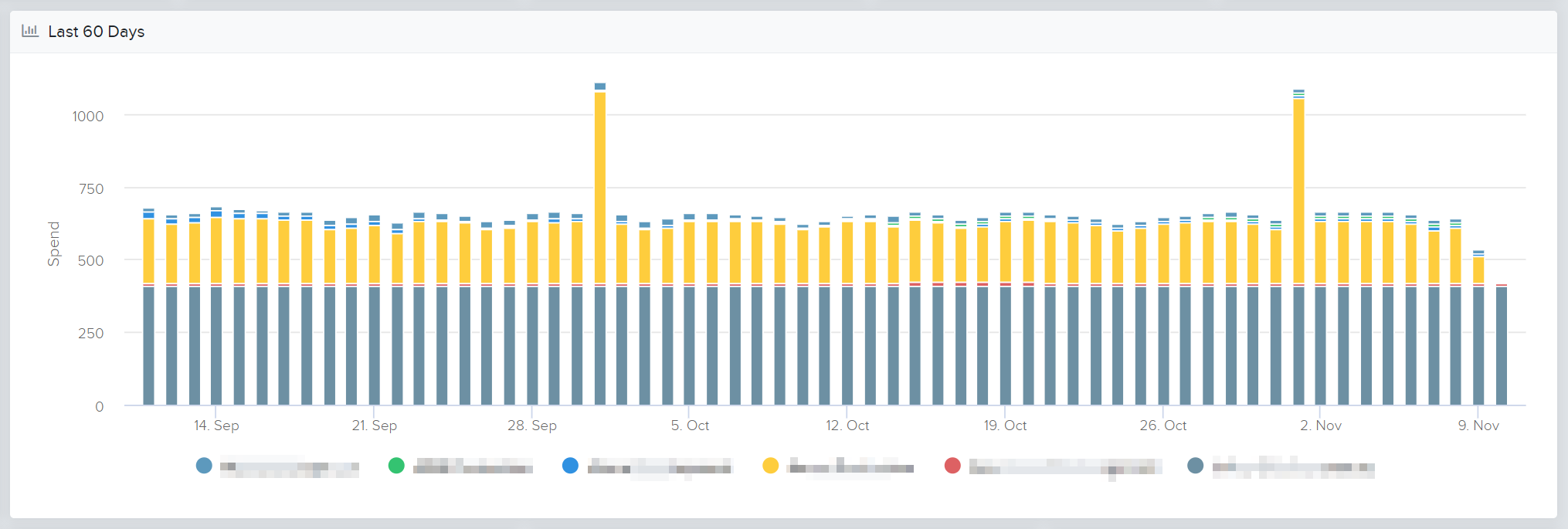
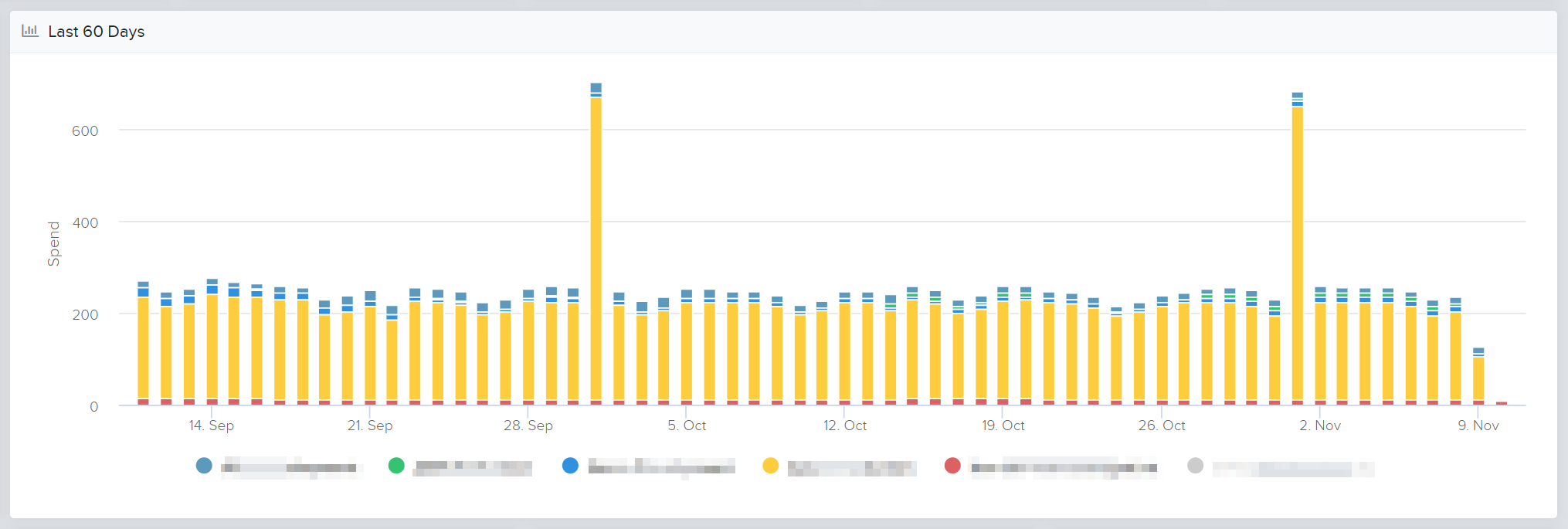
The middle section indicates the top accounts, based on lifetime spend. If the user has less than 5 accounts, all accounts are shown here. The middle section also shows a graph indicating spend per account for the last 60 days.

Top Accounts
Click on the name of an account to further drill down into the account overview. Click on the account row to see the spend in the current invoice period, the days left in the period, and the spend for the previous invoice period.
Last 60 Days
Click on the account name within the graph legend to toggle whether the account data is visualised within the graph.


Bottom Section
The bottom section outlines resource creation and different resource breakdown views.

Resources Created
Indicates the number of resources created over the course of the last 14 days.
Hover your mouse over each bar to see how many resources were created each day. Click on an individual bar to drill down into the resources created for that day.
Breakdown by Account
Indicates the percentage of the total spend that each individual account uses.
Hover your mouse over each section of the pie chart to see the percentage of the total cost for each account. Click on the account name within the graph legend to toggle whether the account data is visualised within the graph.
Breakdown by Category
Indicates the percentage of the total spend grouped by resource category (eg. Compute, Sotrage, Network).
Hover your mouse over each section of the pie chart to see the percentage of the total cost for each category. Click on the account name within the graph legend to toggle whether the account data is visualised within the graph.
Breakdown by Provider
Indicates the percentage of the total spend grouped by service provider (eg. AWS, Azure).
Hover your mouse over each section of the pie chart to see the percentage of the total cost for each provider. Click on the account name within the graph legend to toggle whether the account data is visualised within the graph.